Results may vary
Creative tips only
No professional advice
Photography skills
How to use color theory in photography: step-by-step guide for eye-catching images
Taylor Jensen
May 20, 2026
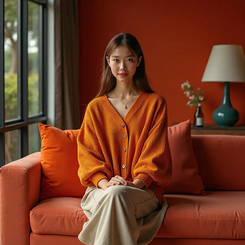
Color theory isn’t just for painters—photographers use it to set the mood, lead the eye, and tell richer stories with every frame. By understanding how different colors interact, you can make your images pop, feel more balanced, or express emotion more clearly. This guide covers the basics of color relationships, shows you how to find or create interesting palettes, and explains why even small color choices make a big difference in your photography.
Using color theory in photography isn’t about memorizing complex rules—it’s about noticing relationships and making intentional choices. Whether you want to evoke calm with soft tones or excitement with high contrast, understanding color palettes can help you shape your story. This article breaks down how to recognize and apply three common color schemes, shares tips for finding palettes in everyday Canadian scenes, and offers practical steps for using color to create images that resonate.
Key color theory concepts for photographers
Complementary palette
Creates bold contrast and attracts attention. Complementary colors sit
opposite each other on the color wheel.
Analogous palette
Gives images a harmonious, calming feel by pairing colors that sit side by
side on the color wheel.
Monochromatic palette
Uses a single color in varying shades, creating unity and visual simplicity.
How to use color theory in your photos
Look for natural color palettes
Before you start shooting, notice colors in your environment. Urban walls, natural landscapes, or clothing can offer surprising color pairings. Canadian street scenes and parks are great places to spot natural palettes that tell unique stories.
Experiment with bold contrasts
Try framing your subject with a background of a contrasting color. For example, place a person in a red jacket against a green wall, or use blue skies with golden fields. This draws the viewer’s eye and adds energy to your image.
Simplify your color scheme
Sometimes less is more. Focus on a single color or a small palette to avoid overwhelming your composition. Monochromatic scenes can be especially effective in minimalist portraits or landscapes.
Edit mindfully for color impact
Use post-processing to fine-tune colors. Adjust saturation and contrast to emphasize your chosen palette, but avoid over-editing—natural color often feels more authentic and engaging.